Ad Creative
Why your ad image is doing more targeting than your targeting is
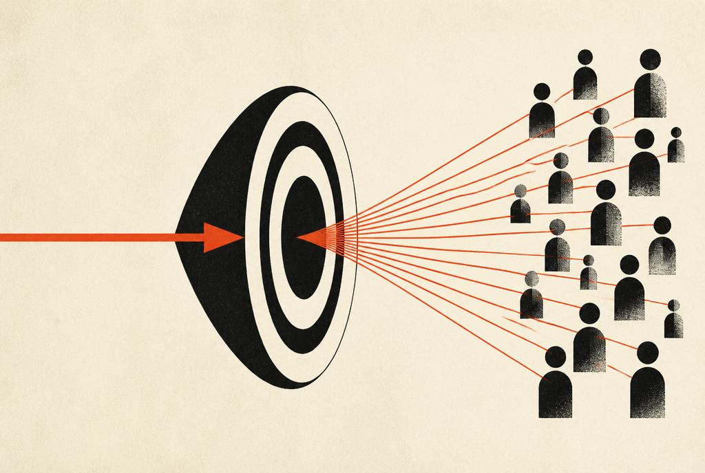
Short answerYour image decides who sees the ad far more than your interest selections do. The algorithm watches who stops, who reads, and who clicks, then goes and finds more of those people. That’s why I say creative is the new targeting. The picture is an instruction written in a language the machine reads faster than you can pick checkboxes. Change the image and you change the audience.
There’s a particular kind of afternoon I’ve spent more times than I’d like to admit. Someone shares their screen, we’re looking at an ad set that isn’t working, and they start walking me through their targeting like it’s a legal case. Interests stacked three deep. A lookalike built off a custom audience built off another custom audience.
And then we scroll up to the creative and it’s a stock photo of a woman laughing at a salad.
Anyways. The targeting isn’t the problem.
What the algorithm actually does with your ad
The delivery system does not read your interest stack and go find those people. That’s the mental model most people carry around, and it hasn’t been accurate for years.
What it actually does is treat your targeting as a starting boundary, then run a much more interesting experiment inside it. It shows your ad to a spread of people, watches what happens, and builds a working theory about who responds. That theory gets refined every hour. Within a day or two it’s operating off behavior, not off your checkboxes.
Which means the thing doing the real audience selection is whatever causes one person to stop and another to keep scrolling. That’s the creative, the image and the first line, and it’s the whole reason creative is the new targeting.
The registration cost that made this concrete for me
I had a webinar funnel where registrations were coming in around $40. Not catastrophic, but not a business either.
The creative was what you’d expect. A stressed-looking guy at a kitchen table with a stack of bills. Very relatable. Very much the kind of image a marketer picks when they’re thinking about the emotional state of the audience.
We swapped it for a plain text overlay that said what the thing was: learn the method to eliminate debt, taught live.
Registrations dropped to $8.
Same copy underneath. Same landing page. Same offer. Same targeting, untouched. The only variable that moved was the picture, and the cost of a registration fell by a factor of five.
Here’s the part worth sitting with. That wasn’t the creative “performing better” in some general sense. It was the creative recruiting a new audience, doing the targeting the interest stack never could. The stressed-guy image attracted people who recognized the feeling. The text overlay attracted people who wanted the method. Those are not the same person, and only one of them registers for a webinar.
Why the boring version usually wins
This is the bit people resist, and I understand why. It feels like a step backwards.
A beautiful photograph is optimized to be looked at. A text overlay is optimized to be understood. On a feed, where someone is moving fast and deciding in well under a second whether this concerns them, being understood beats being admired almost every time.
The photograph says “this is an advertisement, and it is pleasant.” The text overlay says “this is about a specific thing, and here is the thing.” One of those pre-qualifies. The other just decorates.
I’m not arguing every ad should be text on a rectangle. Plenty of image-led ads work. But when they work, it’s usually because the image is doing a job — showing the mechanism, showing the outcome, showing the situation your buyer is actually in — rather than setting a mood.
How to use this deliberately
Stop thinking of creative as decoration for your copy and start thinking of it as your new targeting, the thing that actually selects the audience.
If you want a different type of buyer, don’t go rebuild the ad set. Change what the image says. Want people further along in their thinking? Show the mechanism instead of the problem. Want a broader top of funnel? Lead with the outcome and let the image be legible at a glance.
And when you test, test the concept, not the cosmetics. Swapping a blue background for a green one tells you nothing, because the ad is still making the same argument to the same person. Swapping “here is how you feel” for “here is what this is” changes who shows up.
The practical version: before you touch your targeting again, look at your best performing ad and your worst, and ask what kind of person each one is speaking to. If the answer is “the same person”, your creative isn’t doing the work, and no amount of audience engineering will cover for it.
When it really is the targeting
I should be fair here, because occasionally it is.
If you’re excluding a big chunk of your buyers, if your geography is wrong, if you’ve stacked so many conditions that the audience is too small to leave learning — those are real, and they’re targeting problems. They’re also usually obvious within about five minutes of looking at the account.
What isn’t real is the belief that new targeting, some cleverer interest combination, will rescue creative that doesn’t say anything. I’ve watched people spend months on that. The account was never the problem.
Does creative really matter more than targeting on Meta?
In practice, yes, for most accounts. Targeting sets a boundary and the delivery system optimizes inside it based on who actually responds. Since the creative determines who responds, it ends up driving audience selection more than the interest settings do.
Should I use text overlays on all my Facebook ad images?
Not as a rule, but test them early. Text overlays win often because they make the ad legible in under a second, which pre-qualifies the click. Image-led creative competes well when the image is doing a job, such as showing the mechanism or the outcome, rather than setting a mood.
How do I know whether my creative or my targeting is the problem?
Look at whether your best and worst ads are speaking to meaningfully different people. If every ad makes the same argument to the same person, the creative is not doing any audience selection and that is where to work. Obvious targeting faults, such as wrong geography or over-stacked exclusions, usually show up within minutes.
P.S. — If you only change one thing this week, take your worst performing ad and rewrite what the image says rather than how it looks. That’s usually where the five-times difference is hiding.